Tag Archives: esri

  • 0

Great Opportunity

Category:OtherTags : 

Are you a student who is studying Geography, GIS, or Spatial Statistics or a mature-aged person seeking to re-enter the workforce?  We are looking to train a small team of men and women to use Esri Mapping Software which not only assists us with our mapping business but equips you for your future professional career.

Education Geographics’ Spatial Strategist and Senior Mapper Dr Jeanine McMullan has trained numerous young men and women who have used their mapping skills to secure well-paid careers as Management Consultants for top Four consulting firms, Geography Teachers at High Schools, Town Planners or Professional, full-time Mapping Specialists.

In the second half of the year, casual positions may become available for work on spatial strategy maps, with a focus on transport logistics.

If you are a mature-aged person with a similar background or have experience with Esri software and are seeking to re-enter the workforce on a part-time basis, we would love to hear from you.

To take advantage of this opportunity complete send us an email providing details and a profile about yourself to admin@elaborate.net.au


  • 0
EGS Spatial Analyst and Senior Mapper Dr Jeanine McMullan has just recorded a new video

‘I really like our maps … they’re great fun!’

Category:EducationTags : 

Our EGS Spatial Analyst and Senior Mapper Dr Jeanine McMullan has just recorded a new video.

In the video, headed The Power of the Esri Map Module, Jeanine conveys her sense of excitement at being able to explore innovative new map layers of small-scale data which she can superimpose on EGS catchment maps, so schools can improve how they spatially manage their school to the benefit of their students and their families.

On a practical level, Jeanine and I explain how the layers on an EGS school map can be used to design the most cost-effective school bus routes and stops, based on ease of access from existing students and also from potential additional students, whose families match your school profile.

This means your wrapped school bus can serve as a mobile marketing platform in the most prospective streets in your catchment, as it takes your current students to and from school.

The route design can be adapted annually to changing marketing and logistics strategies, with the new layout downloaded and sent to school drivers or bus companies, and posted on school websites.

Jeanine then shows her genuine enthusiasm for new advanced features in map design which, for example, can help a school begin to estimate the environmental cost in terms of carbon credits of various transport strategies, how to make of use of emergency map layers, showing, for example, flooding risks and fire updates, as well as longer term development plans from your local authorities.


  • 0
So far, so good. But what happens when we check out the profile of the 20 to 25 percent of jobs which come late to the party?

Big Data Improves with Age

Category:Labour MarketTags : 


When it comes to their new Weekly Payroll Jobs and Wages series, the ABS this week agreed with our ADS post of October 6, 2020: Newer isn’t always better (reproduced below.)

With their latest payroll data release this week, the ABS announced it would extend the time between the final payroll period and the release date, by around 9 days. The ABS says this will improve the quality of estimates, through reducing the level of imputation (by more than half) and revisions in the most recent weeks of data.

For our explanation from last October, you can read our original post below.

Newer isn’t always Better – Covid Jobs update from John Black, CEO of Education Geographics, October 6, 2020.

A week or so back we provided a profile of how the broader Australian stereotypes were faring under Covid jobs lockdowns and today we’re urging a bit of caution when it comes to rushing to judgement on the latest payroll stats – because newer isn’t always better.

Although they don’t quite put it like this, the Australian Bureau of Statistics and I both agree the payroll stats are like a fine bottle of red … you’re well advised to let them age a little after opening, before taking the first sip and rushing to judgement.

The official explanation is contained in the recent ABS release on the weekly payroll data for the week ending September 5, where you can see a section called data limitations and revisions. You can find the technical explanations through this link.

https://www.abs.gov.au/methodologies/weekly-payroll-jobs-and-wages-australia-methodology/week-ending-5-september-2020#data-limitations-and-revisions

In this section, the bureau stressed that they were trying to help policy makers during these extraordinary times, by releasing data as close as possible to the period when the activity occurred and then make the data as accurate as possible over time, but incorporating new data when it was received.

This means that the latest data is only about 75 percent to 80 percent complete and can take several months to be fully complete and so the final figures look a lot more attractive after ageing than they do when they’re brand new, as you can see below. Even two weeks of waiting can add one point to the index number for the same release.

Covid Jobs update from John Black, CEO of Education Geographics, October 6, 2020.

So far, so good. But what happens when we check out the profile of the 20 to 25 percent of jobs which come late to the party? Let’s check out our two Stereotype Charts for August 8, with the top one based on the original data and the second one also showing the revised data in yellow bars.

So far, so good. But what happens when we check out the profile of the 20 to 25 percent of jobs which come late to the party?


Suburban Stereotypes - So far, so good. But what happens when we check out the profile of the 20 to 25 percent of jobs which come late to the party?


The central thrust of the original data profiles shows the big urban and provincial city Working Families and the younger and more aspirational, outer suburban Swinging Voters both faring relatively well from the impact of the Covid jobs lockdown. By relatively well, we mean relative to a (non-Victorian) Australian average jobs loss of about three percent from mid-March to August 8.

When we take a close look at the changes in index numbers for individual occupations and the suburb profiles for where they tend to live, we see that the industries which tend to improve after revision include the better-paid ones we often find in the Goat Cheese Circle inner suburbs, such as professional consulting, finance, media and real estate.

This means our maps for the loss of jobs across inner suburbs tend to look a lot greener after a month or so, after new employer data has been reported from those employers reporting less frequently than every week.

So, until the ABS has amassed enough single touch payroll data over a few years of relatively stable labour markets, to make regular seasonal adjustments, treat the latest weekly data releases with caution, as the revised data a month or so older, is often more accurate.

Just like an old vine Barossa Shiraz, big data often improves with ageing.

Next update, we’ll take a look at the impact of the Federal Budget on those industries most impacted by jobs lockdowns.
Talk to you then.


  • 0
Education Geographics has been working closely with Australian Development Strategies and Health Geographics to map future spatial population impacts of Covid.

Looking Beyond Covid – Spatially

Category:EducationTags : 

Australia is predicted to lose a million persons in the next few years, when compared to pre-Covid estimates.

These losses are likely to be highest in suburbs near universities which had previously enjoyed strong population growth, due to recent large intakes of foreign students and very high levels of net overseas migration (NOM).

Education Geographics has been working closely with Australian Development Strategies and Health Geographics to map future spatial population impacts of Covid. The work has been mentored by distinguished Australian economist Saul Eslake.

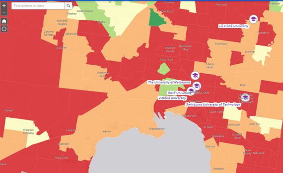
An Esri map provided through this link https://arcg.is/1yX4qD shows our projected Covid impact by SA2 on pre-Covid population estimates.

Marketing Strategies for Schools - Looking beyond covid, spatially, Education Geographics for School Management & Marketing Strategies for education institutions in Australia.

More detailed maps of target areas and numbers will be provided on request to clients of EGS, ADS and HGS.

Unfortunately, we cannot accept new school entrants in Term 1, 2021, but we have limited spaces available for new schools in Term 2.

If your school is ready to plan for your post-Covid future, complete the form below and book an interactive experience with our new 2021 Covid-ready App.


    • 0
    Covid Jobs update from John Black, CEO of Education Geographics, October 6, 2020.

    Newer Isn’t Always Better

    Category:Labour MarketTags : 

    Covid Jobs update from John Black, CEO of Education Geographics, October 6, 2020.

    A week or so back we provided a profile of how the broader Australian stereotypes were faring under Covid jobs lockdowns and today we’re urging a bit of caution when it comes to rushing to judgement on the latest payroll stats – because newer isn’t always better.

    Although they don’t quite put it like this, the Australian Bureau of Statistics and I both agree the payroll stats are like a fine bottle of red … you’re well advised to let them age a little after opening, before taking the first sip and rushing to judgement.

    The official explanation is contained in the recent ABS release on the weekly payroll data for the week ending September 5, where you can see a section called data limitations and revisions. You can find the technical explanations through this link.

    https://www.abs.gov.au/methodologies/weekly-payroll-jobs-and-wages-australia-methodology/week-ending-5-september-2020#data-limitations-and-revisions

    In this section, the bureau stressed that they were trying to help policy makers during these extraordinary times, by releasing data as close as possible to the period when the activity occurred and then make the data as accurate as possible over time, but incorporating new data when it was received.

    This means that the latest data is only about 75 percent to 80 percent complete and can take several months to be fully complete and so the final figures look a lot more attractive after ageing than they do when they’re brand new, as you can see below. Even two weeks of waiting can add one point to the index number for the same release.

    Covid Jobs update from John Black, CEO of Education Geographics, October 6, 2020.

    So far, so good. But what happens when we check out the profile of the 20 to 25 percent of jobs which come late to the party? Let’s check out our two Stereotype Charts for August 8, with the top one based on the original data and the second one also showing the revised data in yellow bars.

    So far, so good. But what happens when we check out the profile of the 20 to 25 percent of jobs which come late to the party?


    Suburban Stereotypes - So far, so good. But what happens when we check out the profile of the 20 to 25 percent of jobs which come late to the party?

    The central thrust of the original data profiles shows the big urban and provincial city Working Families and the younger and more aspirational, outer suburban Swinging Voters both faring relatively well from the impact of the Covid jobs lockdown. By relatively well, we mean relative to a (non-Victorian) Australian average jobs loss of about three percent from mid-March to August 8.

    When we take a close look at the changes in index numbers for individual occupations and the suburb profiles for where they tend to live, we see that the industries which tend to improve after revision include the better-paid ones we often find in the Goat Cheese Circle inner suburbs, such as professional consulting, finance, media and real estate.

    This means our maps for the loss of jobs across inner suburbs tend to look a lot greener after a month or so, after new employer data has been reported from those employers reporting less frequently than every week.

    So, until the ABS has amassed enough single touch payroll data over a few years of relatively stable labour markets, to make regular seasonal adjustments, treat the latest weekly data releases with caution, as the revised data a month or so older, is often more accurate.

    Just like an old vine Barossa Shiraz, big data often improves with ageing.

    Next update, we’ll take a look at the impact of the Federal Budget on those industries most impacted by jobs lockdowns. Talk to you then.


    • 0
    National implications of Eden-Monaro by-election

    National implications of Eden-Monaro by-election

    Category:By-ElectionsTags : 

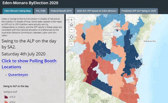
    The Eden-Monaro by-election was held on July 4 and won by Labor’s Kristy McBain, despite a small 2PP swing to the Liberal candidate Fiona Kotvojs.

    Notwithstanding the small net swing, the range of swings for and against the ALP were 25 percent, which indicated that there was a considerable range of political views about each candidate. Modelling of the booth returns showed strong demographic drivers underlying the swings.

    As Eden-Monaro is an excellent representative sample of Australia, demographically, spatially and politically, we profiled the 2PP results by pre-poll and election day booth catchments and projected these onto all Australian federal seats.

    We stress that the by-election results are only a snapshot of how individual candidates performed at a certain time and in a specific set of circumstances and these circumstances will have changed significantly between July 4 and the next election.

    Click to view demographics for Eden-Monaro by 4th July,2020

    Eden Monaro By Election snapshot of results

    The booths swinging to Labor tended to contain higher percentages of lower-income families and retirees, often employed part time in tourism and hospitality jobs which had been heavily impacted by the Covid-related lockdowns impacting this sector.

    Those booths swinging to the Coalition tended to contain higher income families in secure white-collar jobs, least impacted by Covid jobs lockdowns.

    For seat by seat projections of the Eden-Monaro swings onto all current federal seats, see the attached map.


    Comments from John Black, founder of ADS and Education Geographics and map from Dr Jeanine McMullan, CEO of Health Geographics.


    • 0
    Job recovery was underway in May following initial hit in April May 2020

    Jobs Recovery Was Underway In May Following Initial Hit In March/April

    Category:Health,Labour MarketTags : 

    The recovery in many jobs was well under way in May. It’s been most pronounced in those hit first in March/April, working in hospitality, young home buyers, young casual workers also studying at TAFE and this is all to the good.

    The downturn however continued in May among farming and rural communities, especially fishing (think lobsters in cargo holds of international tourist flights). This has impacted coastal and many rural communities.

    The overall picture from March to the end of May shows mainstream suburban families (married, middle aged, with a mortgage and kids at school, two jobs that they really need, and going to church occasionally) to have been much less affected by Covid or by the follow-up lockdowns – down about five percent. These are the groups which weren’t picked up in the polls before the last election and which re-elected Scott Morrison as PM.  

    The groups in deepest trouble (ten percent plus loss over jobs) over the period March to May were – despite a recovery in May – still the workers in casual hospitality and arts & rec jobs (agnostics, twenty somethings, living in small rental units, single, agnostics, no kids, Green voters).

    Link to Map

     Jobs Recovery was underway in May following intial hit in March / April.

    So, good is down only five percent and getting better slowly. Bad is ten percent and getting worse slowly. Spatially, Tasmania looks pretty awful, as do many rural and coastal communities, but the really horrible bits on the map are the inner-city suburbs, particularly in Melbourne and Sydney, where Covid cases have been most concentrated.

    Because the jobs lost in many cases have been second or third casual jobs and less well paid, the impact of jobs lost to the economy has been a bit overstated and has actually increased average incomes per job in many suburban areas, especially with large public sector payrolls.

    This is, however, pretty cold comfort, for those relying on Government handouts and counting down to the end of September.

    What was the real rate of unemployment in May? The short answer is 11.5 percent. This is obtained by maintaining the pre-Covid lockdown participation rate at the March level of 66.2 percent and applying this to the Civilian population 15 years and over, producing a potential workforce of up to 13, 770,061 in May. The combined numbers of officially unemployed and those who dropped out was 1,579,639. We used original or unadjusted figures as seasonal adjustments have become overwhelmed by Covid lockdowns and only original figures are used spatially for smaller areas. The original unemployment figure was marginally higher at 11.7 percent and 12.1 percent respectively in January and February 1993.

    The figure of 11.5 percent also resonates with the new and more immediate ABS series on Weekly Payroll Jobs and Wages, which shows 5.6 percent of main jobs were lost between March 14 and the end of May and the official March unemployment rate was 5.6 percent in March. The two figures sum to 11.2 percent.

    This means the current unemployment rate is as bad now as it was during the worst of the recession in the early 1990’s. The unemployment figure then was marginally higher at 11.7 percent and 12.1 percent respectively in January and February 1993.

    The current figures for the one touch payroll data have been recovering slowly from the initial impact of the Covid jobs lockdown in early April, and this 11.2 percent hybrid figure is likely to continue (barring a second wave starting off from Victoria) at least until the Government begins to wind back JobKeeper and JobSeeker in September.

    The realistic figure for unemployment rates at that time will be determined by whether the rate of recovery exceeds the rate at which those now on JobKeeper or JobSeeker join the ranks of those actively seeking work and satisfying the ABS definition of being unemployed.

    The official ABS labour market unemployment rate is now pretty meaningless, as participation rates will tend to decline with relatively older and younger workers dropping out of the labour market.

    In fact, the first sign of a recovery in a recessed regional labour market can be an interim increase in the local unemployment rate, as formerly discouraged workers are encouraged to seek work by becoming officially unemployed on a temporary basis, while actively hunting for a job and hence immediately boosting participation rates and then growing employment in the longer term.

    So the most useful indicators you should be watching for in coming months are total jobs lost and gained by region and accompanying movements to participation rates.


    Text by John Black, founder of ADS and EGS. Maps by Dr. Jeanine McMullan, CEO of Health Geographics.


    • 0

    Eden-Monaro by-election 2020

    Category:By-ElectionsTags : 

    By JOHN BLACK, Founder of ADS

    The Eden-Monaro by-election will be held on July 4. With a week to go, Labor’s Kristy McBain is the bookies’ favourite on $1.70 to win, with published robo-polls giving her 53 percent of the two-party preferred (2PP) vote.

    Despite trailing in the robo-polls and with Sportsbet paying $2.25, I think the Liberal candidate Fiona Kotvojs is pretty good value for money if you like a flutter. There are a few reasons for this, but first some background.

    Eden-Monaro is pretty close to being Australia’s version of Magic Town, named after the 1947 movie featuring a fictitious version of one of the original United States polling companies. The pollster – played by James Stewart – is obsessed with finding a small town which is a perfect demographic and political sample of the USA. This meant it could be milked cheaply for perfect poll results on everything from toothpaste preferences to voting intention.

    With similar demographics to Australia, Eden-Monaro tends to vote like Australia and return the same result: and this means the party winning Eden-Monaro tends to also win a majority of seats and form the Government.

    Mike Kelly first won the seat for Labor when Labor’s Kevin Rudd won the 2007 election. He won it again in 2010 when Labor also held Government, and he lost it in 2013, when Labor lost Government. So far, so good for Eden-Monaro’s reputation as Australia’s political Magic Town.

    But then the popular Dr Kelly stood again for Eden-Monaro in 2016 and won, despite Labor losing the national election narrowly to the Coalition. He eroded the Eden-Monaro’s Magic Town reputation further in 2019, by holding the seat on 50.9 percent 2PP vote, despite Labor’s failure to regain Government.

    When we look into the demographics of Eden-Monaro, we see it’s very similar to Australia, in terms of its socio-economic indicators which cover job status, education status and income. It also contains some urban overspill from Canberra, some farming and fishing communities and a slice of tree-changing and sea changing retirement communities.

    Click to view demographics for Eden-Monaro

    The Eden-Monaro by-election will be held on July 4.

    The differences between Eden-Monaro and Australia seem minor but explain why the seat went against the trends in 2016 and 2019, sticking to Mike Kelly as a well-regarded political identity.

    Compared to Australia the seat, on average contains more farmers and farm workers and a disproportionate number of retirees. Our demographic profiling of elections back to 1966, shows farm workers and retirees have a weak class vote and are more inclined to cast a large personal vote for any effective MP seen to be doing a good job.

    We did several national demographic models of the 2019 election and on the one we chose, Mike Kelly polled 6.6 percent more than the model predicted.

    With a standard error of estimate of 4.5 percent, this was a strong performance and history tells us that when a popular sitting member like this retires, their personal vote tends to be redistributed back to the opposing party, especially when that party is nominating the same candidate.

    In the case of Eden-Monaro, that party is the Liberal Party and their candidate is again, Fiona Kotvojs. It’s important to bear in mind we model 2PP votes, so one candidate’s overperformance, is also their opponent’s underperformance.

    So, it’s statistically safe to say Kotvojs would have won Eden-Monaro in 2019 with up to 55 percent of the 2PP vote against a less effective sitting MP than Mike Kelly. Hence my tip earlier on the value for money bet.

    But we’re now in 2020 not 2019. Relevant factors to consider since 2019 include.

    Favouring Labor:

    Anthony Albanese is now the Labor Leader, not Bill Shorten. Both men were on similar levels of satisfaction – 41 percent – at similar stages of the election process, but Shorten was on a dissatisfaction score of 49 percent before the last election, compared to Albanese’s 38 percent.

    Scott Morrison performed below par during and after the bushfires which devastated the east coast of the electorate over Christmas and this region was just getting back on its feet when it got whacked again with job losses from the Covid lockdown.

    Labor now appears to be running an effective postal vote campaign in 2020 compared to 2019, when it ran no campaign at all. This is a sleeper for Labor.

    The National Party and the Shooters are reportedly up to some preference allocation tricks in Eden-Monaro to disadvantage the Liberals. Even if true, I suspect these factors can be disregarded. Voters have more important things to worry about at the moment.

    Favouring the Coalition:

    Scott Morrison has performed above par during and after the Covid-Pandemic and lifted his personal pre-2019 election satisfaction score from 46 percent to 66 percent and his Better PM rating from 47 percent against Bill Shorten to 56 percent against Anthony Albanese. Tick one for the Liberals. But this is a pretty big tick, especially in a crisis such as we’re now facing, when voters tend to rally behind the Government of the day.

    The big group relatively unimpacted by the Covid jobs Lockdown is of course public servants, and Eden-Monaro contains a lot of these, due to some fast-growing, high-SES, urban overspill south of Queanbeyan and this included some swings to the Coalition in 2019. I suspect this is a sleeper for the Coalition.

    This leaves us to consider the Robo-polls now putting Labor’s Kristy McBain on 53 percent of the 2PP vote in Eden-Monaro. If you were one of the candidates, you’d rather be McBain on 53 percent, than Kotvojs on 47 percent.

    But other pre-election Robo-polls overestimated Labor’s 2019 vote by three percent at the last election by oversampling IT-savvy, highly-paid professionals and younger highly-mobile, agnostic, Tertiary students, with strong dependence on social media, who love to fill in online media surveys and polls. These were the groups swinging to Labor in 2019. These are the groups now most impacted by the Covid Lockdowns.

    The robo-polls in 2019 also under-sampled working families with two reasonably secure jobs, a mortgage to pay off and dependent school aged kids to look after, and they also under-sampled church goers, especially those on the fringes of our major cities. These are the groups which swung to Scott Morrison and the Coalition and they are the group least impacted by the current Covid Lockdowns.

    The big unknown here are how the public votes during the Covid pandemic and associated jobs lockdown and none of us will know this for sure until we get the results on Saturday night.

    But on the evidence, Fiona Kotvojs is good value at $2.25 for a win. Very good value.

    MAP NOTES:

    We can tell from the online interactive map that the areas hit hardest in Eden-Monaro by the jobs’ lockdown in March/April, were those showing the strongest signs of recovery in May. You can track the impact of the changes by clicking on the stages from 1 to 5.

    We also include map layers showing swings and votes at the 2019 election. The votes provided are based on modelling of all the votes cast in Eden-Monaro, not just the booth votes which are becoming increasingly irrelevant, due to major increases in pre-poll voting.


    Comments from John Black, founder of ADS & Education Geographics and map from Dr Jeanine McMullan, CEO of Health Geographics.


    • 0
    Impact on Australian Employment by COVID-19

    Impact on Australian Employment by COVID-19

    Category:Health,Labour MarketTags : 

    We trace the jobs impact of the Covid-19 labour market shutdown in a news article and a linked online story map published in The Australian today.

    The story outlines the evidence that the jobs downturn impacts announced by the Prime Minister in late March were sudden and deep and that since then, there have already been some tentative signs of a small jobs recovery in those states with lower levels of new Covid-19 cases, in apparent anticipation of an easing of social distancing and travel restrictions. However, in those states with continuing cases of new community transmission the downturn in higher SES professional jobs has deepened.

    The article is available only to The Australian readers and subscribers and covers the new payroll data provided to the public by the Australian Bureau of Statistics, as a public service, while the data is still being developed.

    The ADS/Esri maps in the article are based on 2019 Federal electorates and use the same data, so caution is advised. They are user-friendly for mobiles and are available on the ADS website at https://www.elaborate.net.au/impact-on-australian-employment-by-covid-19/

    John Black, ADS Chairman. Dr Jeanine McMullan, Chief Mapper.


    Click for Federal Seats Jobs Map

    Impact on Australian Employment by COVID-19 by John Black, ADS Chairman


    • 0
    Total Job Losses Due TO Covid19

    Mapping the impact of Covid downturn

    Category:HealthTags : 

    A co-operative venture between Australian Development Strategies, Health Geographics and Education Geographics has set out to regularly monitor, profile and map big data on jobs and wages from 10,000,000 Australians during the Covid recession.

    The jobs data is now being collected weekly via the Tax Office one touch payroll system and published fortnightly by the Australian Bureau of Statistics.

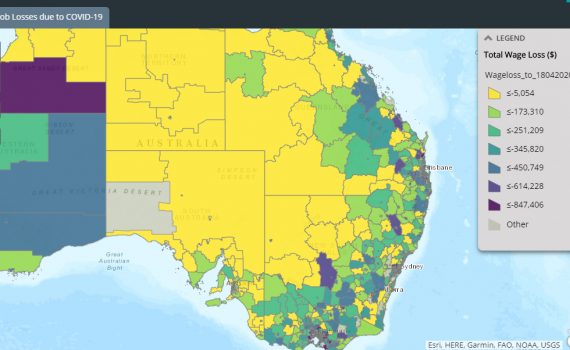
    The first of a series of maps has been published today on the three web sites via the following link https://arcg.is/1HeD5n.  It will allow readers to see the impact of the Covid restrictions and monitor changes as they are withdrawn in stages over coming months.

    More detailed maps and profiling will be made available to clients of the three companies ADS, HGS and EGS.

    The first maps published today show most jobs and wages lost by suburb have been close to capital city CBDs, coming as a direct result of the closure of gyms, personal training groups and theatrical productions.

    The biggest per capita loss of jobs has occurred across smaller suburbs in rural and tourist regions like Mount Beauty in Victoria or Port Douglas in far north Queensland.

    Suburbs across Australia relatively unaffected by jobs loss or per capita jobs loss have dominated by public sector jobs, such as Duntroon, Macarthur or Barton in the ACT, in remote indigenous communities like the APY lands in South Australia or Arnhem Land in the NT, or in mining towns like Mount Isa or Weipa in Queensland or Roxby Downs in SA.

    As schools progressively re-open and restrictions are lifted on travel, hospitality and public gatherings, we will monitor the changes in jobs and wages for our readers and clients.